Branding
Originally, I was tasked with devising standards for applying the Fossil logo to leather products. However, this project coincided with a larger re-branding effort. The scope of the project evolved, and my research and initial concepts became the basis for a new logo.
Problem
The existing logo was busy with type, icons, and rule: it seemed dated and heavy. Fossil needed a logo that could be applied consistently to a wide range of products. It also needed to reflect Fossil's aim to bring midcentury aesthetics to the modern customer.
Solution
Drawing on my research, I recombined elements from Fossil's original logo and other brand icons to create a simpler, more flexible design. It could easily be applied to different products and executed in a variety of mediums, from a deboss on leather to foil on paper.
All Fossil products and collateral are now aligned through consistent visual language, supported by the new logo. It has been applied systematically throughout the distribution chain. The logo appears on everything from tags and store signage to marketing campaigns and the e-commerce store.
The Process
Discovery & Research
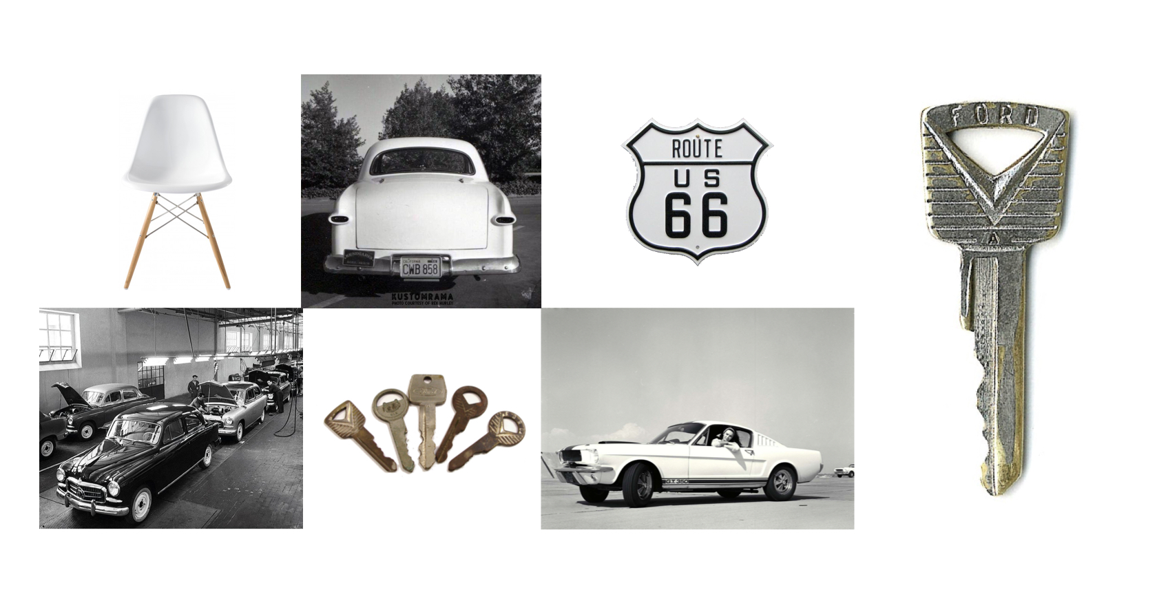
I inventoried how the Fossil logo was applied to products, noting inconsistencies and the variety of execution styles. I also looked through Fossil's archives, which documented the company's thirty year history, to find patterns in design language and iconography. One consistent icon was the lock and key.

Inspiration
In my research, I discovered this 1950s Ford key. I recognized it as a quintessential icon of the midcentury. It conveyed the period's emphasis on mass production, streamlined design, and optimism about the future. This authentic midcentury artifact would inform the new logo design.
Iteration
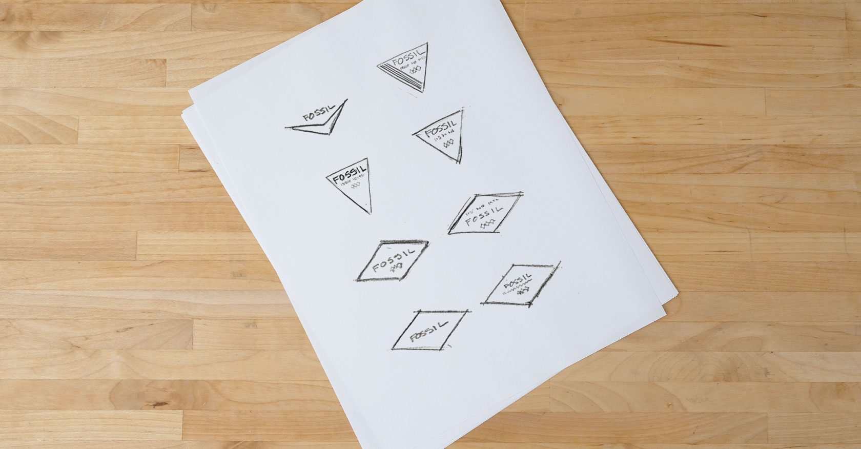
I sketched a series of thumbnails to explore how logo elements could be rearranged into a simpler logo. The logo needed to embody Fossil's modern vintage concept. I extracted the diamond from the original logo and made it central to my new designs, as it fit well with the midcentury aesthetic. It would also need to be versatile. I had to consider how it would execute in a variety of mediums at different scales, from print and digital marketing to application on products.
Application
I presented a few design directions to the creative director. One concept was selected to be refined by the graphics team into the current branding system. After the new logo was established, my team would be responsible for exploring ways to incorporate and apply the logo to handbag designs, both explicitly, through direct application, and implicitly, through diamond motifs.
