Feed the Future
Feed the Future is the US Government’s global hunger and food security initiative. They develop strategies to tackle hunger and nutrition around the world. To do that, they bring together and orchestrate experts from across governments, non-profits, and the private sector to make progress. They needed a new website to better communicate the many aspects of their work to both their partners and the public: their mission, their approach, and the impact of their projects.
Problem
Feed the Future had a wealth of resources, but they were difficult to navigate. Additionally, the information felt rather disconnected. There were statistics and results, but there was no narrative to help the public understand what all this meant, that these statistics represented lives changed.
Solution
Designed and developed a responsive website on a new CMS platform. The new CMS structure would help them better maintain and edit their content going forward, while also allowing them to draw deeper connections between related content.
The Process
Understanding Audiences
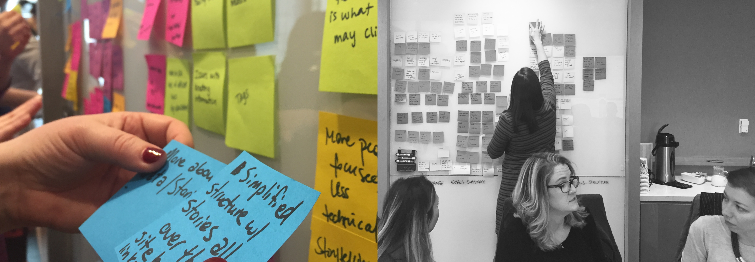
Before we began designing, we needed to understand the different audiences coming to the website and what they were looking for. In order to do that, we facilitated several workshops with Feed the Future to discuss all their users, categorize them, and prioritize them. We found that the audiences could be organized into three core groups: those looking for data-oriented results, those looking for stories of the human impact, and those looking to get involved. We kept these groups in mind as we started to develop new navigation structures and redesign pages.
Information Architecture
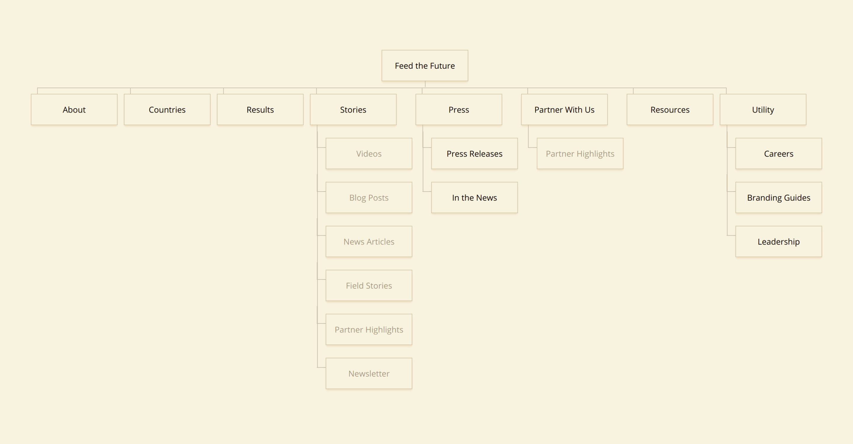
A content audit revealed some key problems. All serial content was in one area, regardless of purpose. This included research, success stories, press releases, director’s statements, and more. This made it difficult for audiences to filter through the resources to locate the specific data or stories they were searching for. Additionally, a few important pages were getting buried. These pages contained important information, but they didn’t have much traffic because the navigation didn’t account for these pages. We developed a revised IA to account for these buried pages, added new content categories, and renamed navigation items to be clearer.
Wireframing Key Pages
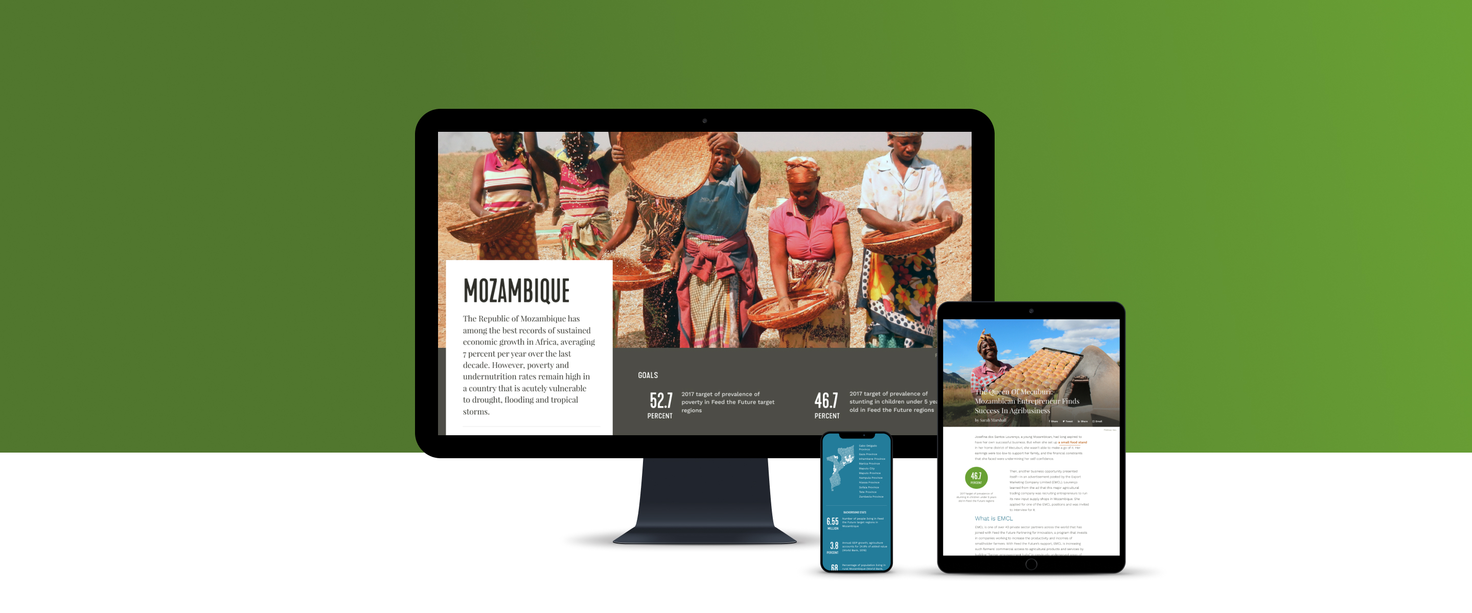
We realized early on that we would need to devote a fair amount of time to redesigning country pages. Country pages aggregated all the information about the projects Feed the Future was doing in a target country. This was a huge opportunity to illustrate Feed the Future’s strategy and impact.
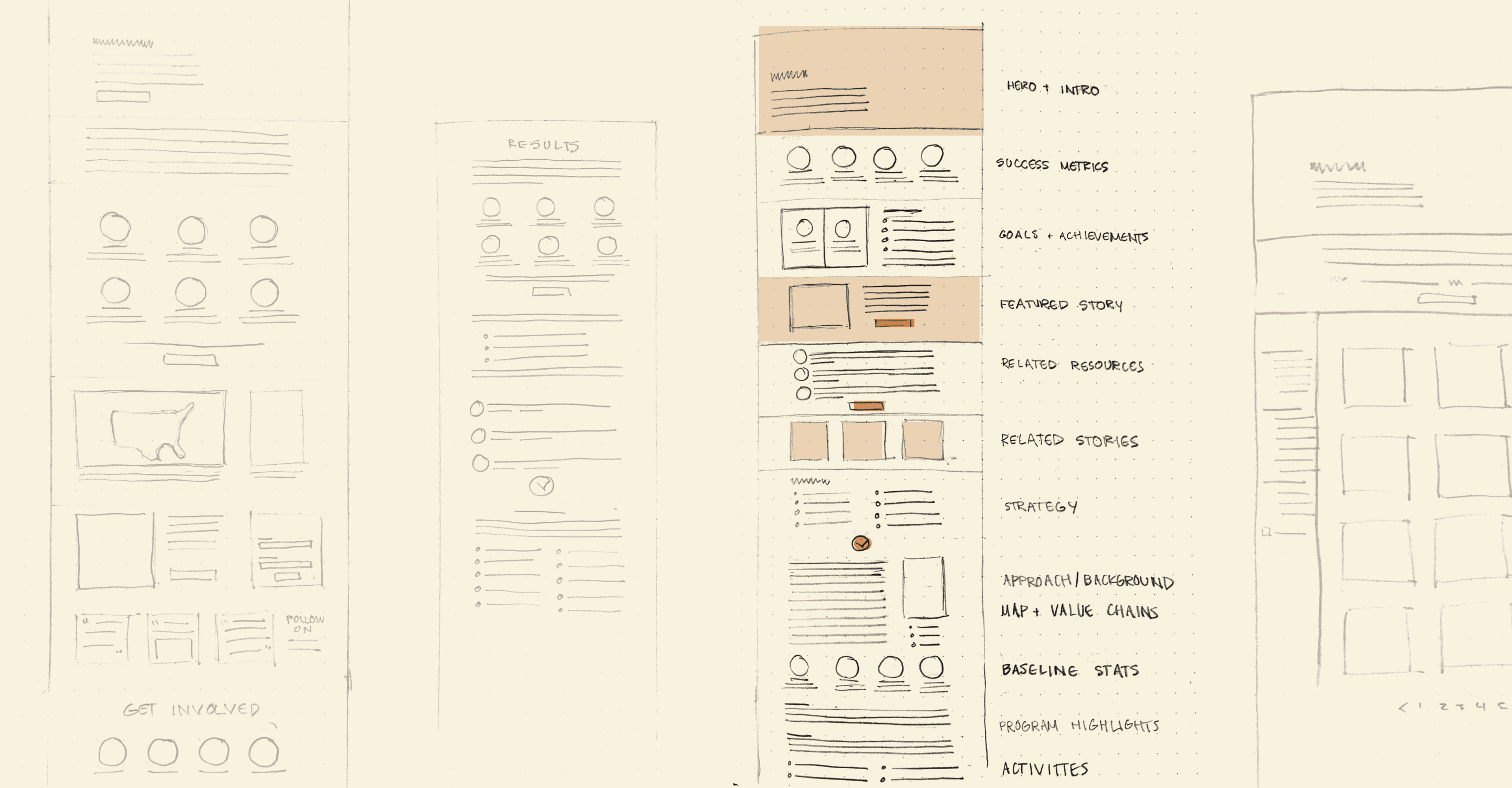
In the original site, the information was dense and difficult to read. They used tabs to break up the information. Superficially, this made the pages appear shorter, but it also buried much of their important work. We worked on developing wireframes that would prioritize information based on the audiences we had discussed.
Data-oriented audiences were looking for a quick snapshot of progress in that country. We moved stats up to the top of the page along with a summary to give the proper context for those stats. This effectively gave this audience a quick snapshot of the work in a given country. Audiences interested in more detail could read on to find out more about the strategy, tactics, and projects in the country. Throughout the page we broke up the text with images, maps, and links to related stories to help people see a connection between the numbers and real human lives. While the page appears longer, we’ve created a narrative flow through the page, established a hierarchy that fits our audience needs, and broken up the content to make it more digestible.
Working with a designer and front-end developer, we developed a full system of templates and blocks for the CMS that would be accessible, flexible, and responsive. This would enable the USAID team to more easily manage and maintain the site going forward.